INTRO
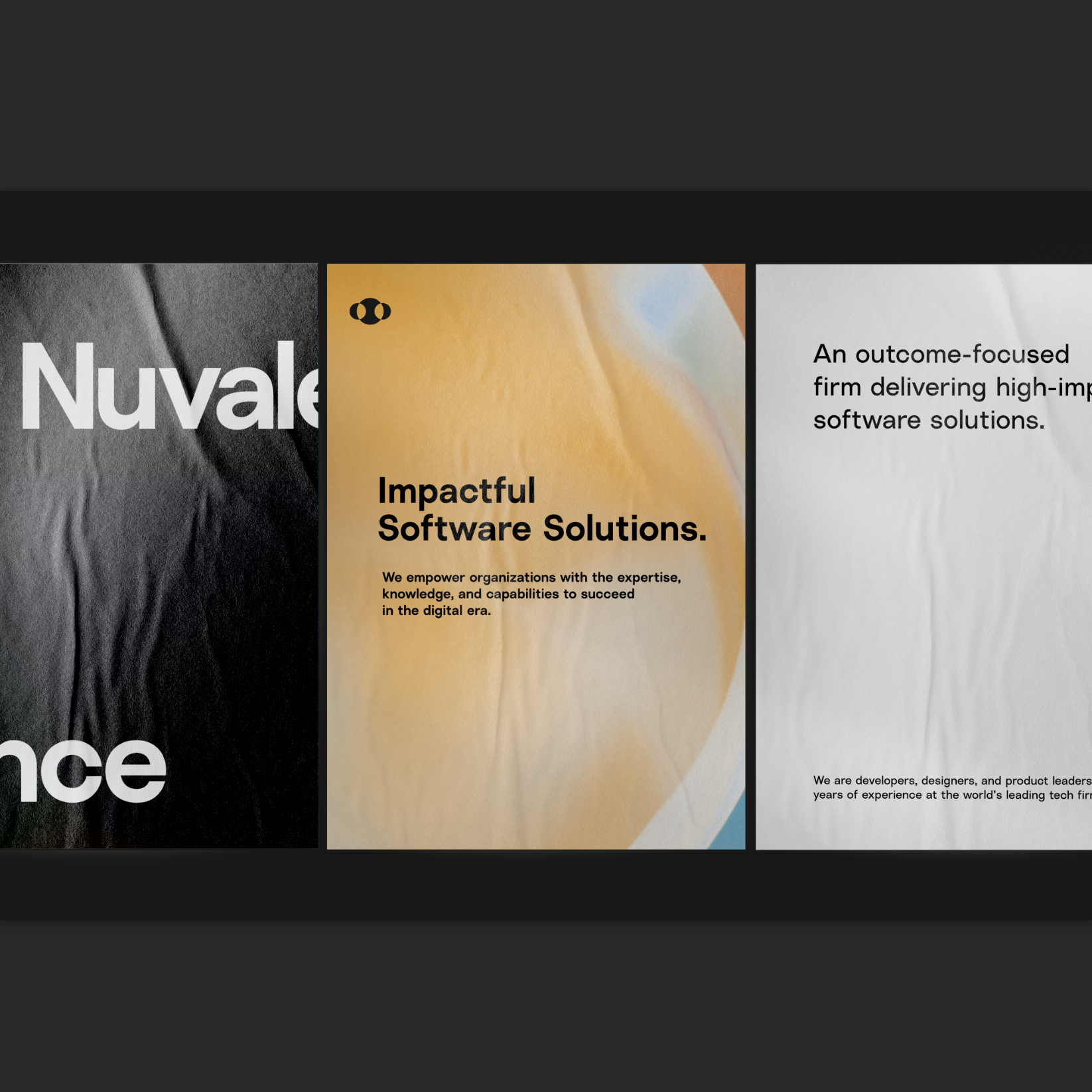
An outcome-focused firm delivering high-impact software solutions.
We are developers, designers, and product leaders with years of experience at the world’s leading tech firms. We’ve come together as Nuvalence, garnering top technology talent to help organizations across all industries build software solutions that, above all else, deliver impactful outcomes.
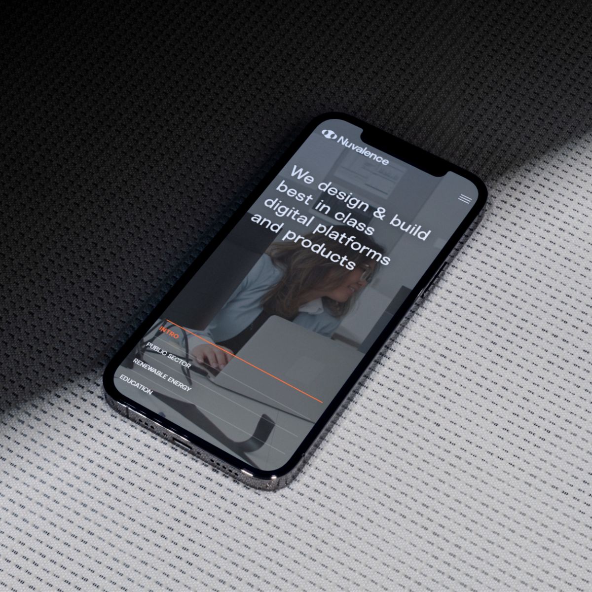
Today Nuvalence continues to evolve because our people do. Our brand echos continuous evolution with a simple, sophisticated, and modern design system that allows the focus to remain on what’s important to us: our people and our clients. To reflect and celebrate how Nuvalence began, we’ve weaved the story behind our name into our brand. Hint: it all started with a connection and a covalent bond.
BRANDMARK
Nuvalent Bond
A covalent bond occurs when atoms share valence electrons to gain stability. Like the transformation that emerges when molecules come together, we help transform our clients’ realities by acting as the ‘bond’ that connects organizations to their most ambitious goals. This molecular reaction inspired the three circles in our logo and symbolizes what is foundational to us: connection and transformation. Our full brand mark, wordmark, and logomark are used in varying scenarios, offering flexibility and responsiveness depending on context and scale.

BRANDMARK

WORDMARK

LOGOMARK
A covalent bond occurs when atoms share valence electrons to gain stability. Like the transformation that emerges when molecules come together, we help transform our clients’ realities by acting as the ‘bond’ that connects organizations to their most ambitious goals. This molecular reaction inspired the three circles in our logo and symbolizes what is foundational to us: connection and transformation. Our full brand mark, wordmark, and logomark are used in varying scenarios, offering flexibility and responsiveness depending on context and scale.

BRANDMARK
Connecting Life and Code into One Symbol
We created our logo using the Golden Ratio for a perfectly proportionate and balanced brandmark. Nuvalence’s relationship to global industries and the coded, analytical world reflects the Golden Ratio’s connection to mathematics and the natural world.
COLORS
Hyper clean with a pop of Persimmon.
FROST WHITE
RGB
255 255 255
CMYK
0 0 0 0
SLATE
RGB
31 31 31
CMYK
0 0 0 88
PERSIMMON
RGB
247 110 57
CMYK
0 55 77 3
SMOKE
RGB
0 0 0
CMYK
0 0 0 1
SKY BLUE
RGB
124 204 247
CMYK
46 4 0 0
Headlines
Subheads
Body Text
TYPOGRAPHY
Simple and distinctly Nuvalence.
Our primary typeface is fresh, simple, and accessible. Its tight apertures and refined, laid-back finish create a simple yet distinctly ‘Nuvalence’ typeface that enables clear communication across our brand.
ANIMATION
Our Brand in Animation.


IMAGERY
Our imagery embraces our diverse workforce, which spans over three countries. Simple backgrounds allow the focus to remain on our team members.
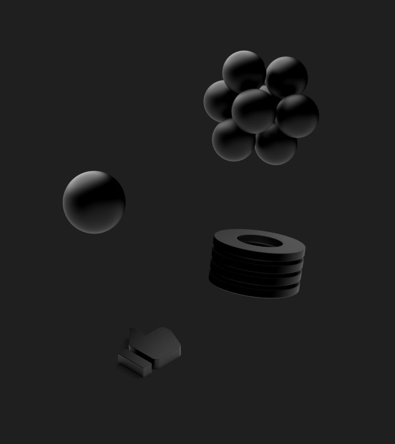
Renderings shown throughout our collateral and website are geometric to mimic the scientific models of bonds and molecules.
Renderings shown throughout our collateral and website are geometric to mimic the scientific models of bonds and molecules.
When we show connections through photography, we make sure that the only shape used is circular. This way, we remain consistent with our logo while subtly referencing its molecular inspiration.
IMAGERY
People & Culture
Our imagery embraces our diverse workforce, which spans over three countries. Simple backgrounds allow the focus to remain on our team members.
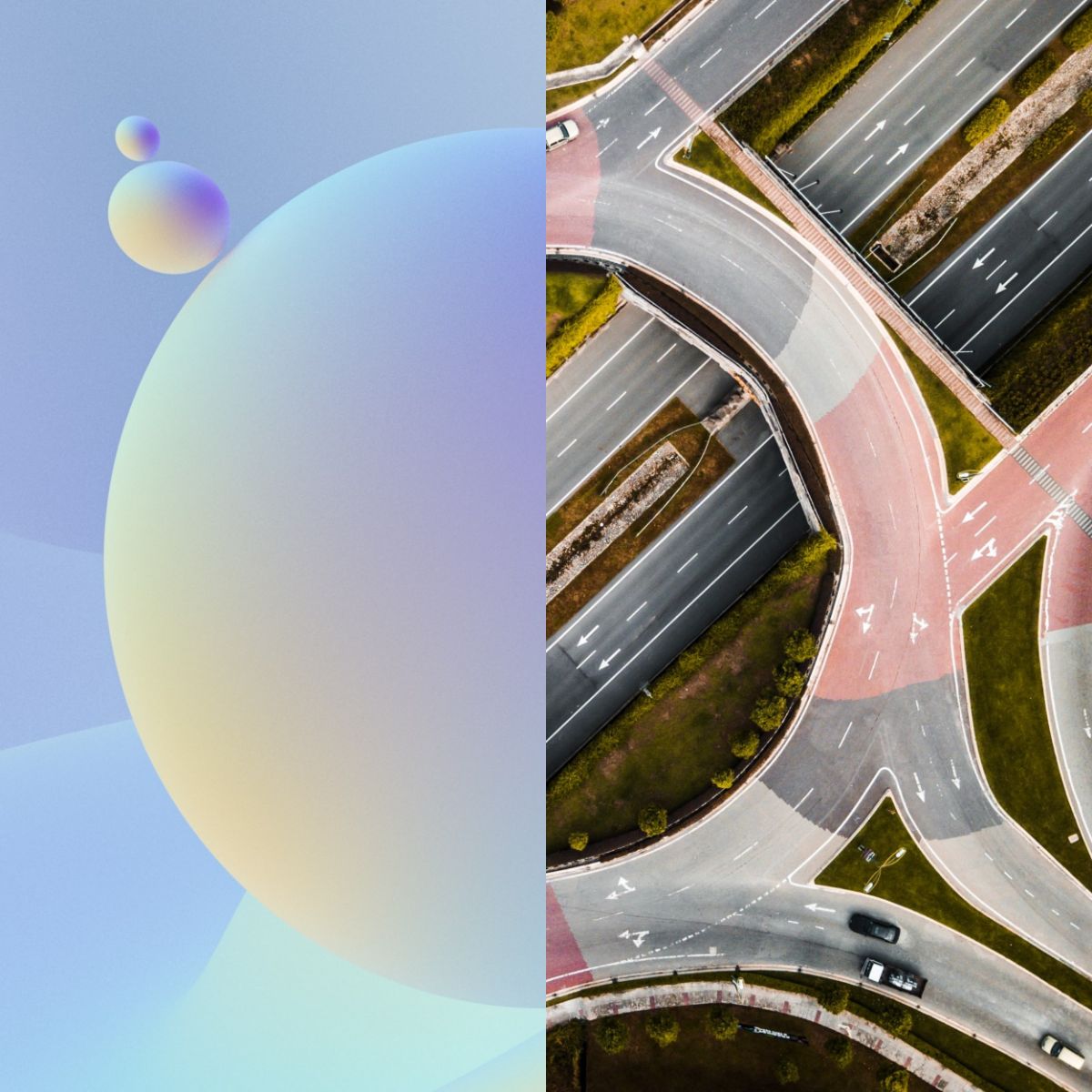
Renderings
Renderings shown throughout our collateral and website are geometric to mimic the scientific models of bonds and molecules.
Circular Connections
When we show connections through photography, we make sure that the only shape used is circular. This way, we remain consistent with our logo while subtly referencing its molecular inspiration.
PERSIMMON ACCENTS
Balancing the Dark Tones
In contrast to the dark tones used throughout our brand, Persimmon is a vibrant pop of color and an ode to the passion, determination, and fresh perspective we always bring to our work. You’ll find Persimmon in our physical collateral and in small but significant places on our website, like buttons, links, and hovers.