

Starter Guide to Developing Accessible Websites
Starter Guide to Developing Accessible Websites

Alex Hill
Alex Hill February 14, 2023
Overview
Accessibility is a key consideration when designing and creating any website and should be a conscious part of any frontend developer’s thought process. There are even laws and regulations to mandate accessible content, such as Section 508 of the Rehabilitation Act in the United States. Failing to comply with these rules and regulations can lead to severe financial penalties, especially if your platform serves the public sector.
As responsible digital citizens, it’s important to keep the internet accessible and usable by all. We’ve especially witnessed the importance of this in recent years as in-person services have transitioned to being primarily accessed, or only available, online.
But what does it actually mean to develop with accessibility in mind? This article will provide you with a basic background on website accessibility and will arm you with several tips that you can use to make your websites more accessible.
Table of Contents
Approach to Accessible Development
Accessibility can be daunting to tackle, especially when trying to retrofit an existing website to conform to a set of standards. However, once you’ve worked to educate yourself and practice those learnings, designing for accessibility becomes just another part of your development and testing methodology. I liken it a lot to mobile development, where every time I make a new page or feature change, I check how it looks and controls on a mobile device or emulator.
I was also struck by how much accessibility design is an art rather than a science. A lot of the development time is spent in conversations with product managers and other developers about what the best solution is or why one solution is or isn’t acceptable. It can be helpful to search the usual online forums for tips and tricks, but often the solution you need to find will be specific to your use cases, the components and elements you use on your pages, and how they interact with each other, etc.
For example, you may have a date picker inside of a form input or maybe a tooltip inside of button text. Components nested in these ways may not receive focus from a keyboard (or not in the right order) until you make it happen. Once you’ve finished this article, you’ll be more aware of situations like these and some common solutions.
Best Accessibility Practices for Immediate Impact
Tools for Development
Typically, we test a website’s level of accessibility by utilizing the tools that other users with barriers (e.g.visual impairment) may use, such as a screen reader. Many accessibility-focused tools exist, such as NV Access (NVDA), JAWS, and OS/browser-specific extensions and apps (I use Google’s Screen Reader extension for Chrome). Download one and try it out for yourself; it can be quite jarring to have every element of your page read out loud if you’ve never navigated this way. You can use it to identify where your site may be missing information that a screen reader needs to read aloud. Notably, you may even find that a screen reader is reading aloud more information than a user requires, such as every cell in a table with no way to skip ahead or stop it!
Another part of our testing process is to navigate through all possible flows and combinations on our website while only utilizing the keyboard. Some users may be unable to use a mouse so this is an important consideration for making our website accessible. If you are unable to fill out certain form elements, the sequence of operations is incorrect, or you can’t select certain options while only using the keyboard, we regroup and identify other solutions that fill that need.
There are also some tools/extensions that can rate your website based on a number of accessibility-related factors. Lighthouse is built into Chrome’s DevTools and will analyze your page to give it a score, checking various aspects such as color contrast, ARIA (Accessible Rich Internet Applications) attribute usage, tab index, and more. We’ll get into all of those topics later.
Semantic HTML
There are several fairly quick things that you can do to make your site more accessible without having to engineer any real code. All or most of these can be accomplished purely through HTML.
Using correct semantic HTML is a key part of accessibility. Web templates and stylesheets like to turn links into buttons, buttons into links, pictures into buttons, etc. Using HTML elements for an unintended purpose can make it difficult for a screen reader to communicate to the user what an element is for. One important consideration here is to use headings consistently. Make sure there’s one on every page, the h1 -> h5 order is correctly nested and don’t use CSS to turn other elements into a heading. This is confusing to screen reader users as a broken heading hierarchy can lead one to assume they missed a section.
Taking this further, we can use several HTML tags, such as p for paragraph, header, footer, nav, and article, which will communicate the intent of an element much better than “div.” There is often no practical purpose to using these semantic HTML tags, you could just use div or span instead. However, these more specific tags will help screen-reader users quickly determine the purpose of each element and its location on the page. It’s also more readable! See Below are examples of good and bad HTML.
<header>
  <h1>Webpage title</h1>
  ...
</header>
<main>
  <h2>Main Content title</h2>
  <article>Article here</article>
</main>
<footer>
  Contact us!
  <div class="contact-info">...</div>
</footer>
<div class="header-content" id="header">...</div>
<div class="main-content" id="main">
...
<div class="article-section">...</div>
...
</div>
<div class="footer-content" id="footer">...</div>ARIA
Another relatively quick thing to add is aria-labels (a label attribute specifically used by screen readers to provide an accessible name), as well as some other attributes provided by WAI-ARIA. This is the next preference after using semantic HTML to inform a screen reader what the purpose of your HTML elements is. Aria-labels can also be helpful when a font or button containing an image may sometimes be difficult to read.
WAI-ARIA provides a number of attributes for these purposes. By utilizing aria-role and aria-label, the screen reader will read out to a user whatever we set as the role or label, even if a label element isn’t visible normally. Further, we can use attributes like aria-live to inform a screen reader that content has changed, and aria-required to read out to a user that a form input is required. See Mozilla’s WAI-ARIA basics for more information on WAI-ARIA and for helpful use cases for your projects.
Tab Index
One easy fix that starts to bleed into the “decisions” realm is setting tab index. Ensure all interactable elements on the page are reachable by keyboard, and only those elements are in the tab index. Keyboard users have to “tab” through each element on the page and it is confusing (especially for screen readers) and tedious for keyboard focus to reach elements that aren’t interactable.
Some elements may be reachable with focus, such as a “skip link” (more later), but make sure those elements have “tab index = -1” set, as they are not normally in the tab order. Setting tab index to -1 will remove an element from the tab order (though it can still receive focus programmatically), and setting tab index to 0 will add an element to the tab order based on the order it appears in the DOM.
Now that you have the ability to add and remove elements from the tab order, it’s important to also check that the tab order is the same as the expected order of elements on the page. Put another way, screen reader and keyboard users should be able to navigate your web page in the same order as interpreted visually. This may require reordering some HTML elements or adjusting your CSS layouts. Always check with a screen reader yourself to verify!
Tab index implementation starts to require more thought and development when you have an element that should not normally receive focus in the tab index, but you do want it to be read out by a screen reader, such as an error message or some other notification to a user. As previously mentioned, you can set tab index to -1 to remove this element from the tab order, but you can still programmatically set the focus to that element. I also use tab index = -1 to remove the main content container from the tab order, while still letting the skip link focus on that element when it is clicked.
<label>Second in tab order <input type="text"></label>
<label>Third in tab order <input type="text"></label>
<label>NOT in tab order <input type="text" tabindex="-1"></label>
<div>NOT in tab order</div>
<div tabindex="0">Added to tab order (fourth in this case)</div>
<label>First in tab order <input type="text" tabindex="1"></label>
Skip Links
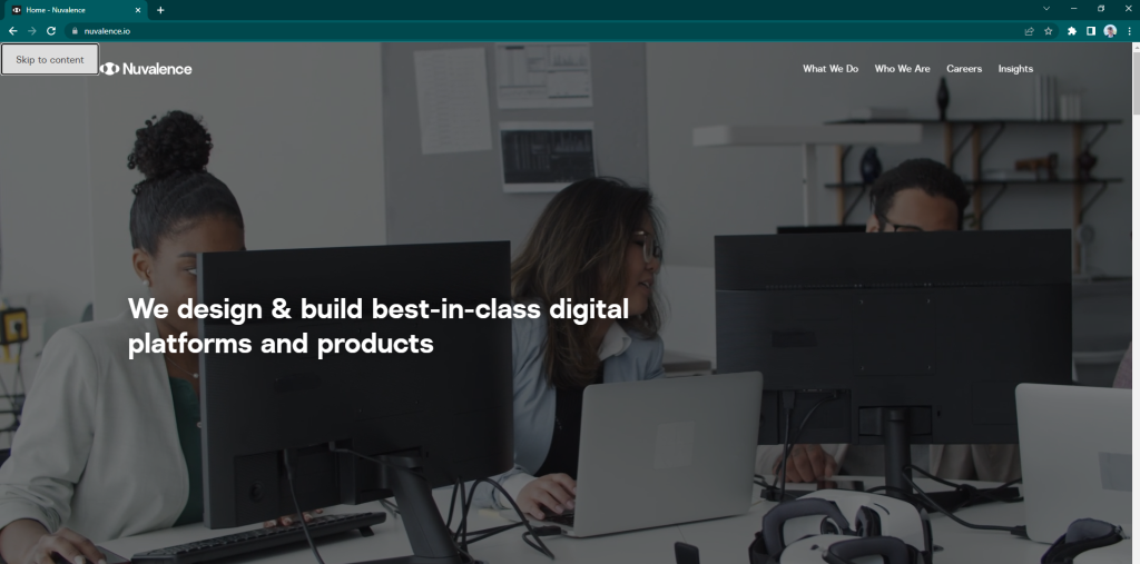
One of the most surprising things I discovered while working on accessibility was the prevalence of “skip” links on web pages. The majority of users may never notice them, but most major websites have them. Try it for yourself when you visit a news site or major retail site, or even Nuvalence’s website! Click on the main content/background, refresh the page, and hit Tab. The first highlighted element on the page will read “Skip to content.”
These links are incredibly important for keyboard-only users to be able to sufficiently navigate your page, skipping past tedious menus and “top of page” that would otherwise require 10+ key presses. For users who may load several pages while browsing your website, this would be incredibly time-consuming and may lead to frustration and lower retention/conversion.
How do you utilize one of these skip links on your website? First, decide what element should receive focus. The best practice is to focus on the outer container for your main content, whatever is below the navigation links on that page. You’ll have to make this decision and set that element on every page of your site. Then, create a hidden link, probably in your header configuration. Set up your website to set focus to the element right before that hidden link (I created a hidden, empty span right before the link). When a user loads your site and hits “Tab” to start navigating, the first element they are highlighting will be the “Skip to main content” link, and they’ll be able to easily and quickly get right to the content of the page.
<span tabIndex="-1"></span>
<a (click)="clickMainSkip()" tabindex="0">Skip to main content</a>

<navigation-header></navigation-header>
<div id=”mainContent”> … </div>
public clickMainSkip() {
Document.getElementById(‘mainContent’).nativeElement.focus();
}Color Contrast
Color contrast is also a paradigm you’ll have to tackle as you design for accessibility. This refers to the difference in color between different elements and their backgrounds and can be an important factor to help low-visibility users utilize your site. Fortunately, we have accessibility evaluation tools such as Lighthouse and WAVE that can point out color contrast issues that might not be obvious to the untrained human eye. Once you’ve identified issues, try out new colors and work with designers (if applicable) to find either a new background or element color to pass these evaluations. This may take some trial and error but settling on a suitable color palette and setting those colors as global variables can save a lot of time in the future.
Summary
This is just a glimpse into the development process and a few relatively easy ways to start getting your website up to snuff regarding accessibility. There is much more to learn and a lot more measures that can be taken to make your website fully accessible. However, by following these basic tips, you can begin to approach projects through an accessibility lens and continue to compound that knowledge throughout your career. By doing our individual parts, we can work towards creating a web that is usable and accessible to all.
To learn more, I recommend HTML: A good basis for accessibility by Mozilla, an in-depth review of the concepts covered in this article (and more!).